Need help in using our WordPress theme?
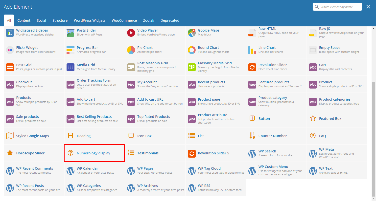
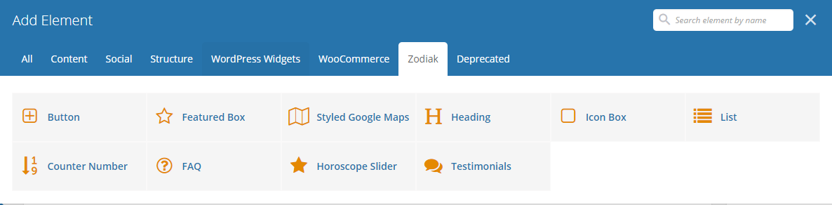
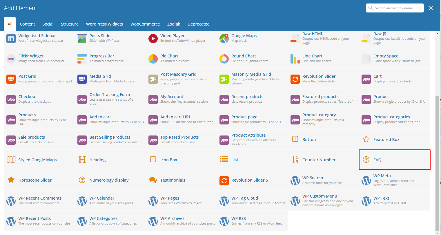
With Zodiac comes many custom shortcodes for (Visual Composer) VC that are used to show content created in Zodiac.
Below you will find short information about this Visual Composer elements:
|
|
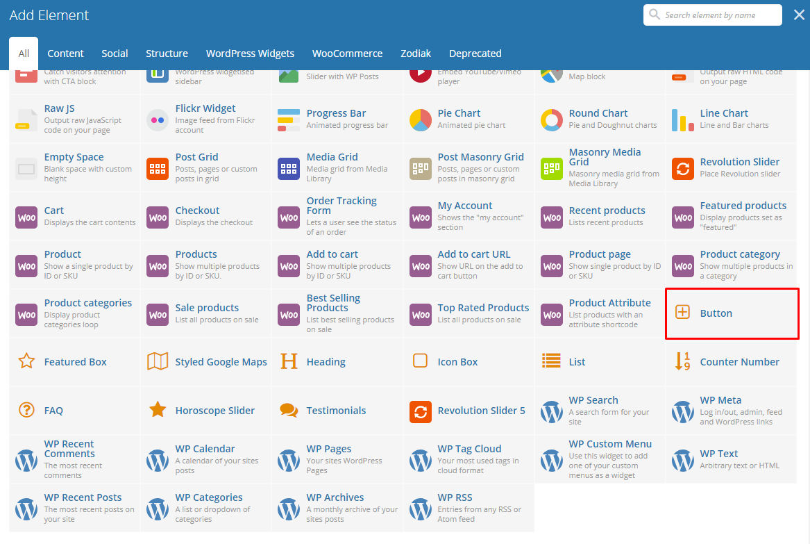
This theme comes with VC element that give you the option to create buttons that can be used in the theme.
|
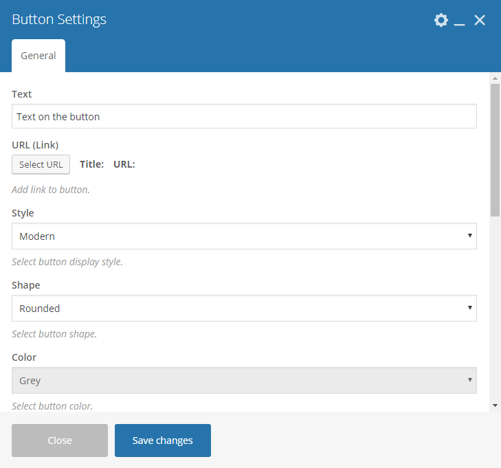
-General Tab-
Text - The label of the button.
URL - URL link for the button.
Style - Type of button showing.
Color - Color of the button.
Size - Size of the button.
Alignment - Where the button is located.
Add Icon? - Option to add an icon in the button. If Add icon is Yes:
- Icon Alignment - Alignment for the Icon.
- Icon library - Where the icon you want to use is located in.
- Icon - Add the icon you would like to use.
CSS Animation - Shape of the button.
Element ID - Color of the text label.
Extra class name - Option to be able to open the link on a new tab.
Advanced on click action
|
|
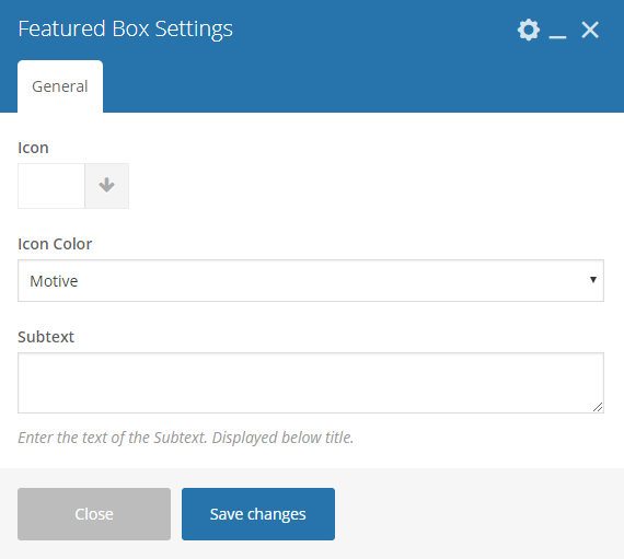
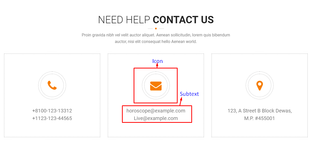
This shortcode will let you add an Icon with text below.
|
-General Tab-
- Icon - Options for the icon shown in the icon box.
- Icon color - Color of the icon image.
- Subtext - Text below the icon.
|
|
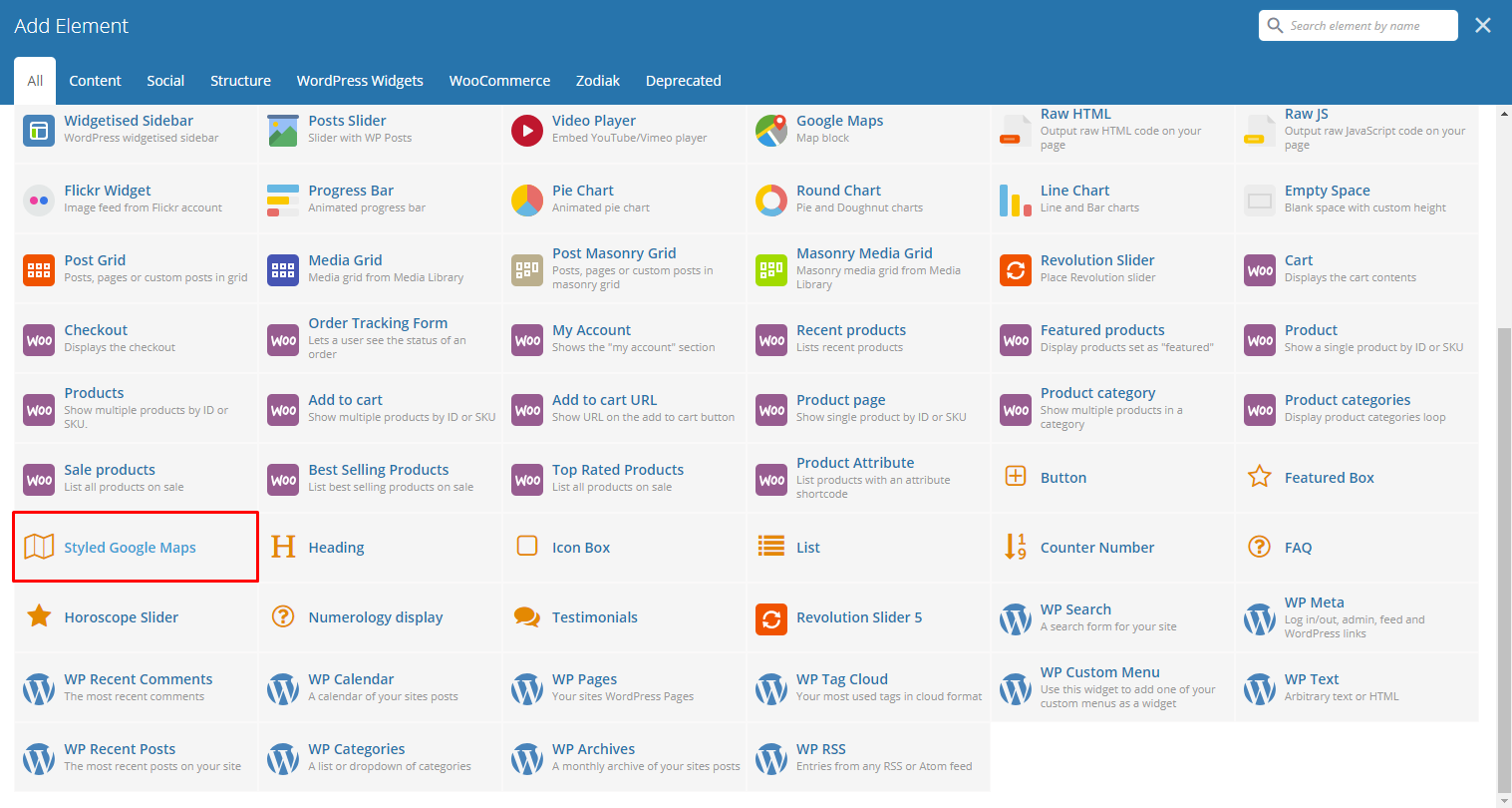
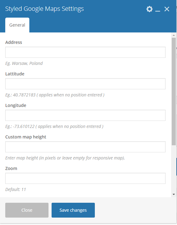
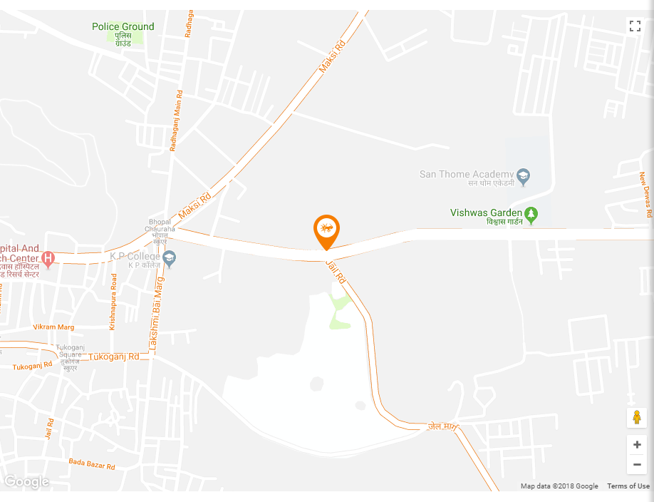
Lets you add a styled google map on a page. You will be able to customize this map in the Styled Google Maps Settings.
|
-General Tab-
- Address - Set an address for the map.
- Latitude - Option to add a latitude of the address.
- Longitude - Option to add a longitude of the address.
- Custom map height - Height of the map.
- Zoom - Zoom percentage of the map.
- Map marker - Option to add a custom map marker.
- Map style code - Paste “JavaScript Style Array” here, you can find and create it on: snazzymaps.com
|
|
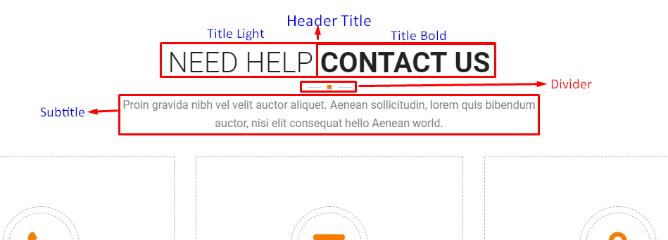
This theme comes with VC element that give you the option to create a header title that can be used in the theme.
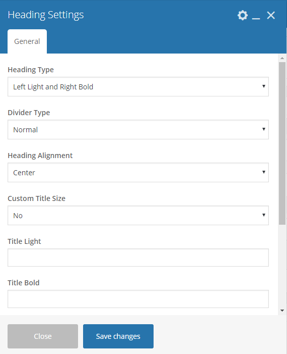
|
-General Tab-
- Heading Type - The look of how the title would look like.
- Divider Type - The type of divider.
- Heading Alignment - Alignment of the heading.
- Custom Title Size - Size of the text in the header.
- Title Light - Text with white text color.
- Title Bold - Text with the custom color and is bold.
- Title Color - The color of the title bold’s font.
- Header Subtitle - What is written as the subtitle of the title.
- Subtitle Color - The color of the subtitle’s font.
|
|
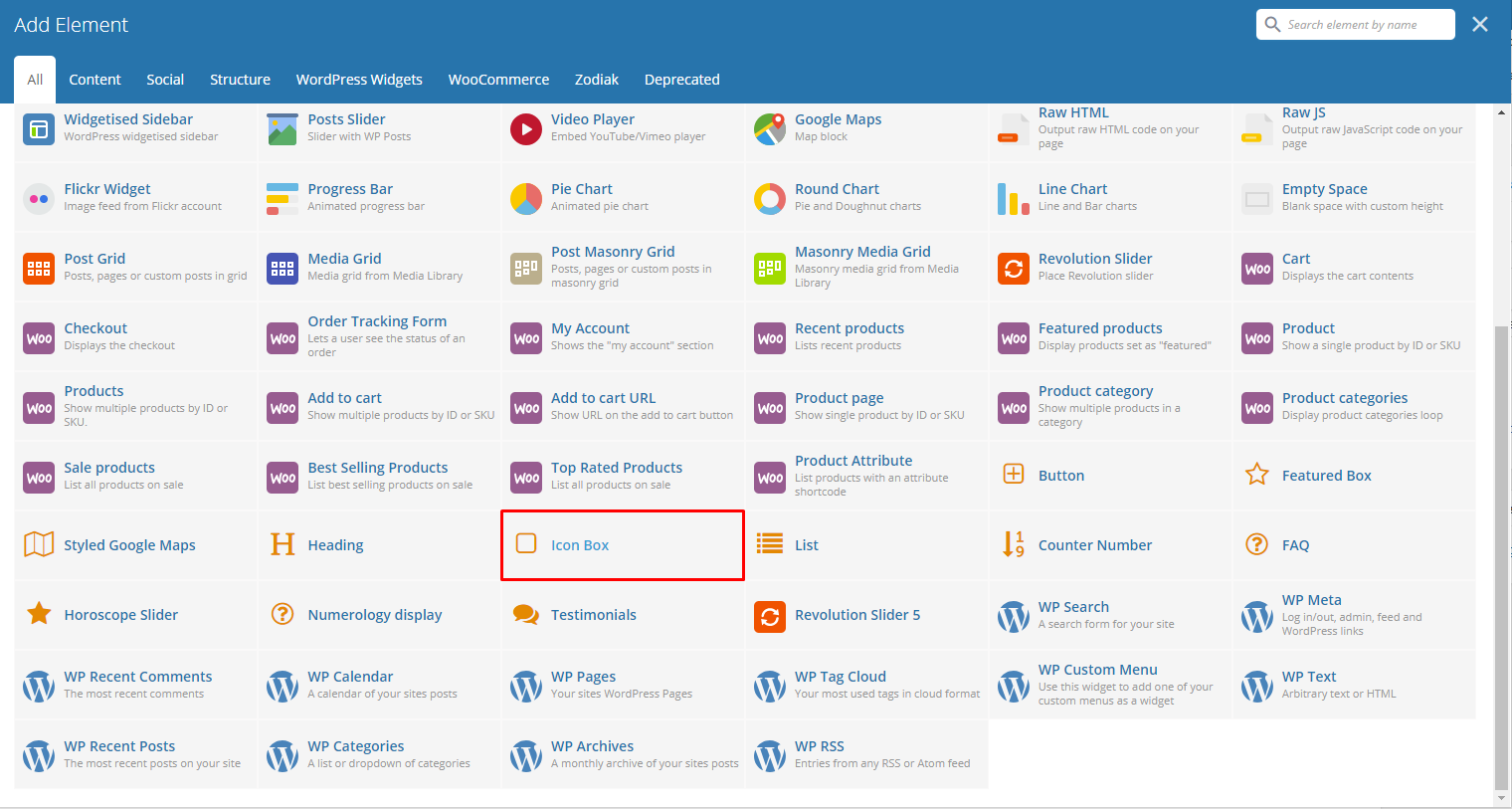
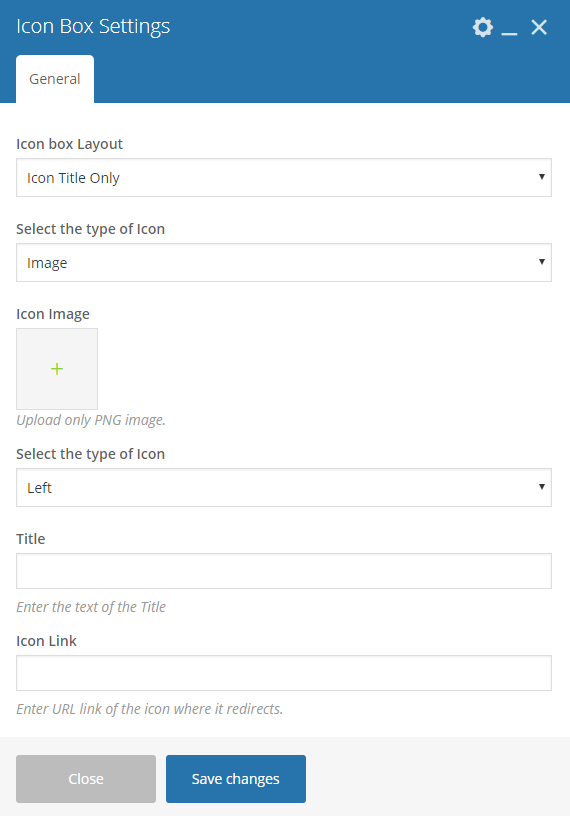
This element lets you add an icon box with many option on how it would look like on a page. You will be able to customize this icon box in the Icon Box Settings.
|
-General Tab-
Icon box Layout - Options on how the icon box would look.
Icon Title Only
Display Icon or Image
Select the type of Icon - Option to add an icon or image in the info box.
Image
- Icon Image - Choose an image to show.
- Select the type of Icon - Select the Icon’s alignment.
- Title - Title shown in the button in the icon box.
- Icon Link - Link for the icon.
Icon
- Select the type of Icon - Select the Icon’s alignment.
- Icon - Title of the Icon Box.
- Title - Title shown in the button in the icon box.
- Icon Link - Link for the icon.

Icon With Subtext
Image
- Icon Image - Title of the Icon Box.
- Select the type of Icon - Select the Icon’s alignment.
- Title - Title shown in the button in the icon box.
- Icon Link - Link for the icon.
Icon
- Select the type of Icon - Color scheme of the icon.
- Icon - Title of the Icon Box.
- Title - Title shown in the button in the icon box.
- Icon Link - Link for the icon.

|
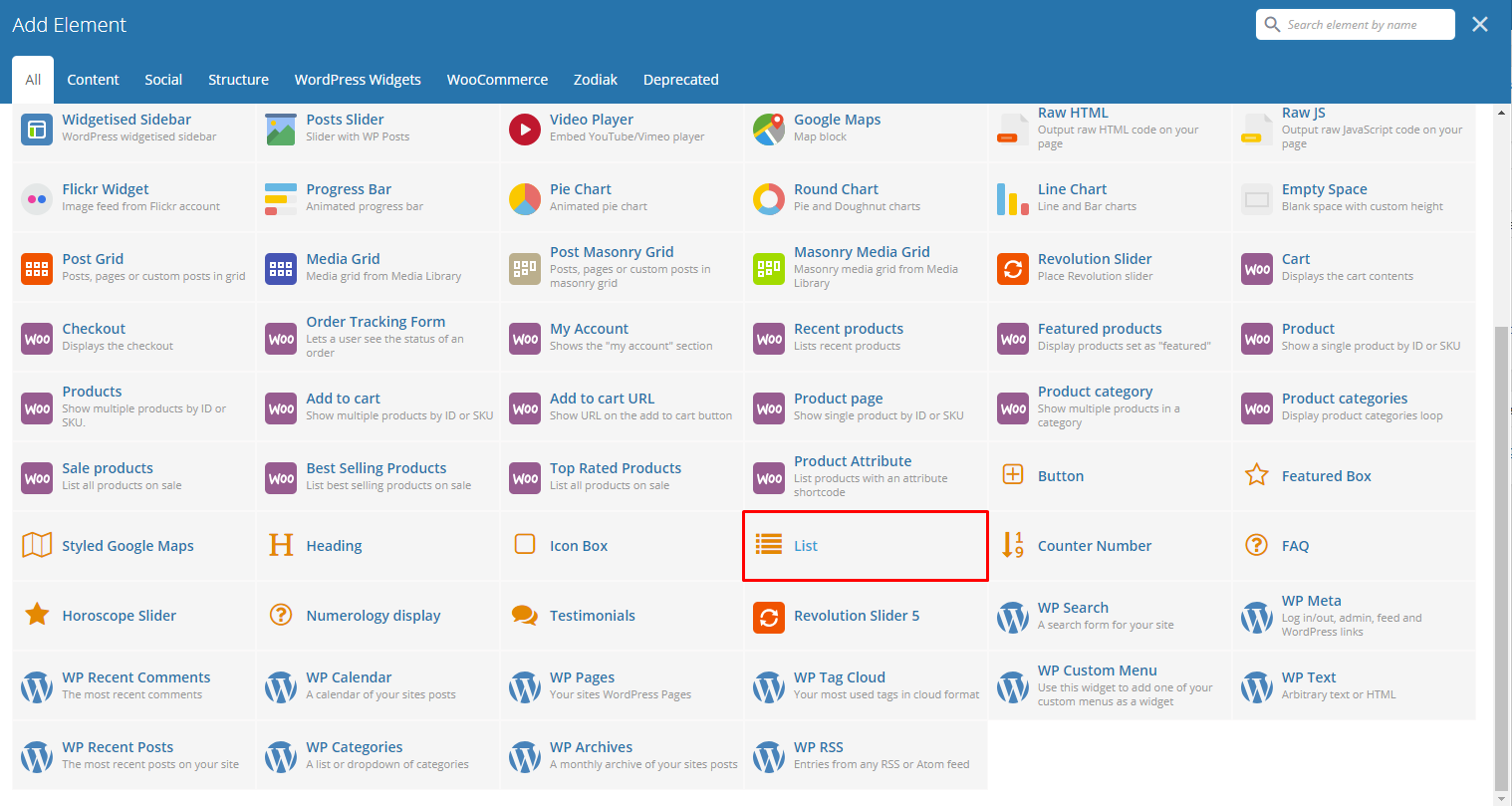
This element will let you add a list of items with icon.
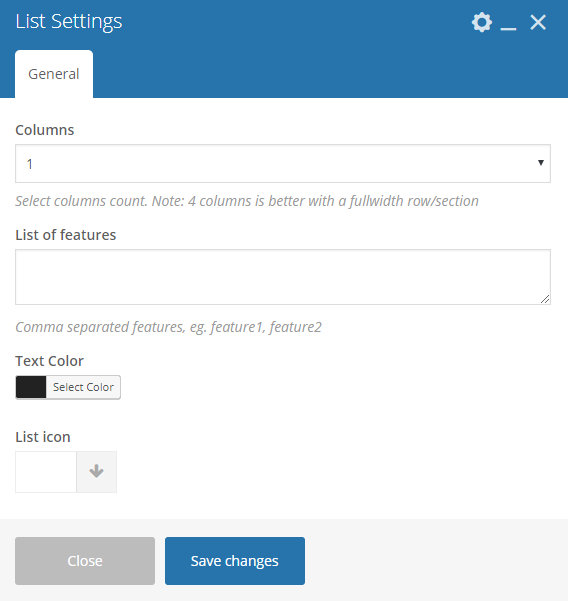
|
- Column - Number of Column in the list.
- List of features - List of features in the list, separated by a comma per features.
- Text Color - Text color of the text in the list.
- List icon - Choose an icon to use beside the text.
|
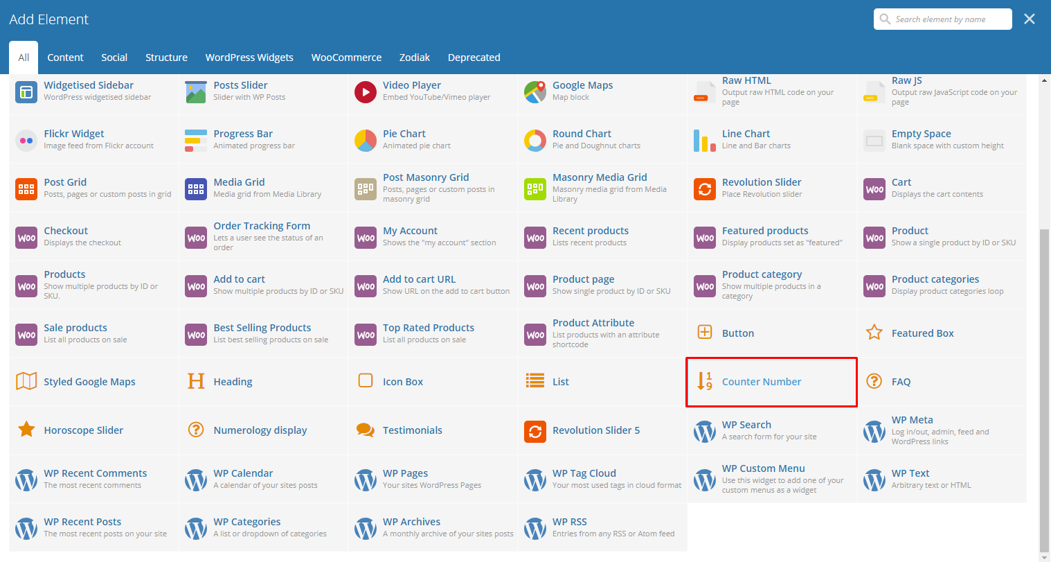
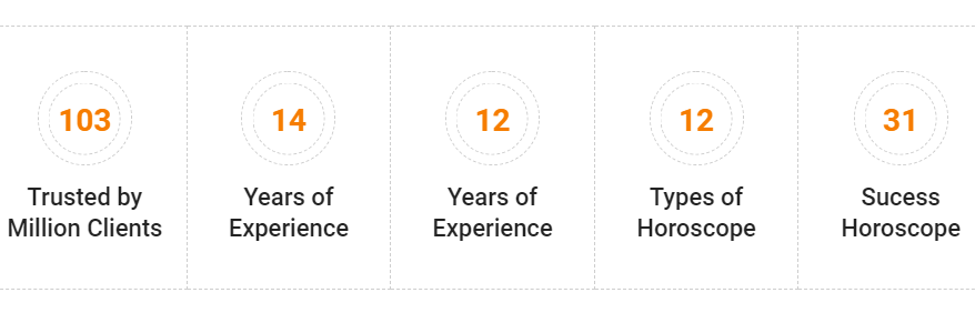
This will create a Number Counter with description.
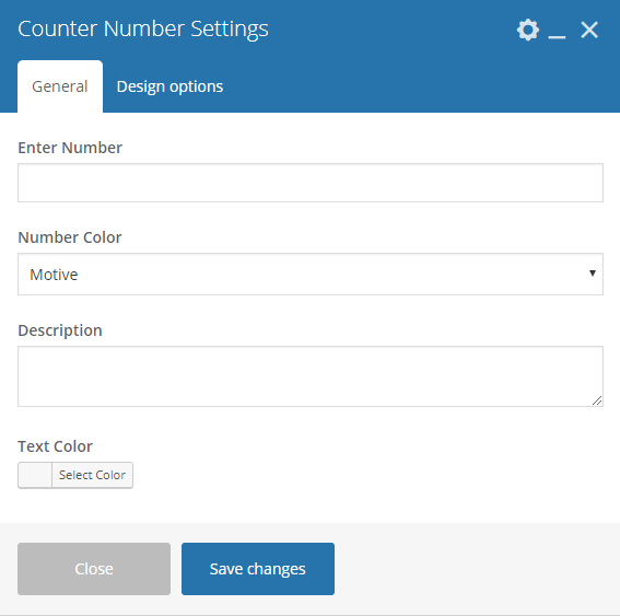
|
-General Tab-
- Enter Number - Enter the number for the counter.
- Number Color - Text color of the number.
- Description - Text below the number counter.
- Text Color - Text color of description.
-Design options Tab-
- Design options - Add/Change the margin, border, or padding of the promo section.
- Border color - Color of the border line.
- Border style - The style of the border line.
- Border radius - The size of the border.
- Background - Background color or image of the promo section.
|
|
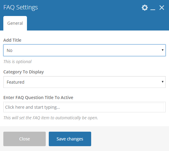
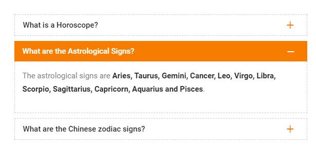
This element lets you add an FAQs with category on the page.
|
-Category Tab-
Add Title - Option to add a title on top of the FAQs.
- Header Title - If Yes, this option will show. Text for the title.
- Title Align - Alignment of the title.
- Title Color - Text color of the title.
Category To Display - Choose a category in the FAQ to post.
Enter FAQ Question Title To Active - Choose an FAQ item that will be open.
|
|
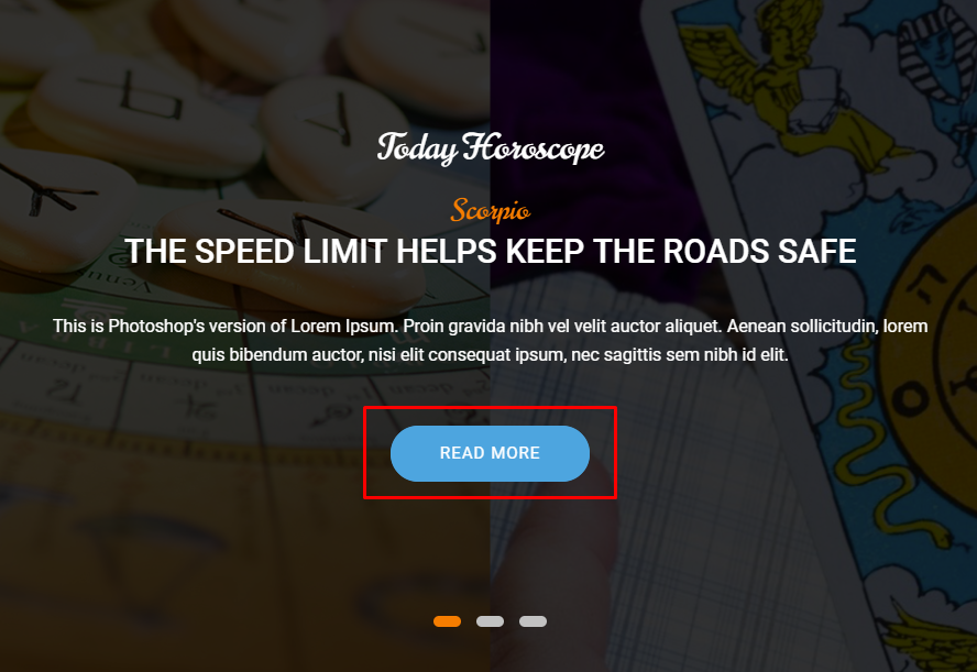
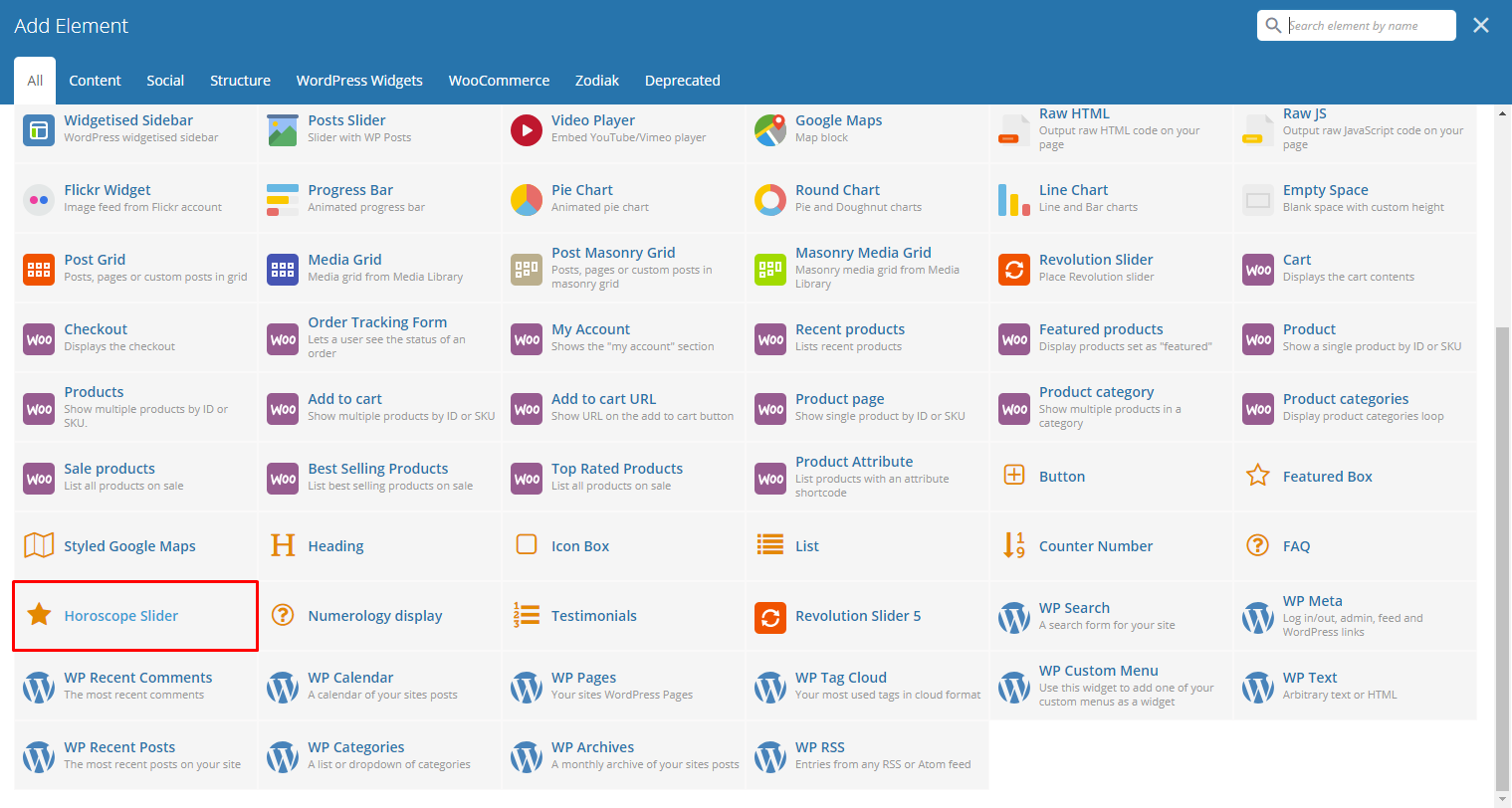
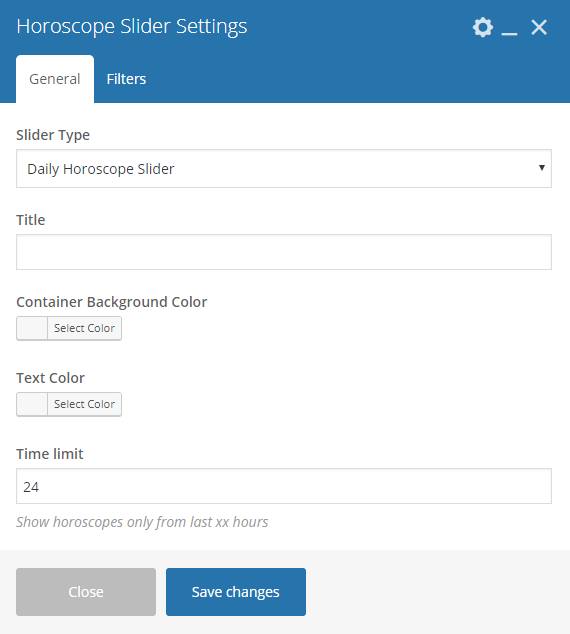
This element lets you add a Horoscope slider in the page.
|
-General Tab-
- Slider Type - Font color of the testimonials.
- Title - Make the slider automatically move.
- Container Background Color - Speed of the autoplay.
- Text Color - Option to make the testimonials fade rather than slide to change.
- Time limit - Option to show navigation dots at the bottom of the testimonial slider.
-Filters Tab-
- Limit - Set results limit.
- Skip X elements - Skip a number of elements from the results.
- Order - How the posts order looks.
- Order by - How the posts are ordered.
- Specify Horoscope Items - Only selected posts are shown.
- Exclude Horoscope Items - None of the selected posts will be displayed.
- Specify Horoscope Categories - Only show posts under the categories.
- Exclude Horoscope Categories - None of the posts under the categories are shown.
- Specify post tags - Only show posts with selected tags.
- Keyword search - Show items with certain keyword.
|
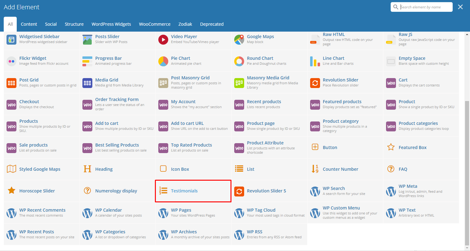
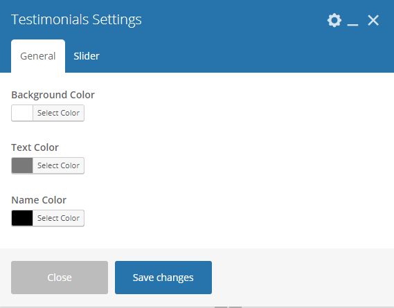
Gives you an option to show Testimonials that are made on your site.
|
-General Tab-
- Background Color - Title of the Testimonials block.
- Text Color - Number of testimonials being shown in a row.
- Name Color -
-Filters Tab-
- Dots - Option to add dot navigation in the slider.
- Autoplay - Option to make the slider move on its own.
- Speed [ms] - Speed of the slider.
- Order - How the testimonials order looks.
- Order by - How the testimonials are ordered.
- Limit - Number of items to show in the page.